Width of lines should be .25 point (or .003”) or thicker in order to ensure they reproduce adequately.
No type smaller than 6 points. Letterpress excels at printing type and handles most fonts very well. Still, don’t use type smaller than 6 point. Outline your fonts when submitting your files.
Number of inks: letterpress printing traditionally uses 1 or 2 spot colors. The cost increases with each additional ink. 3 or 4 spot colors make for an extravagant and lavish production, though it sure is pretty if you have the budget.
Screens are best suited for offset printing. Letterpress excels at printing colors at 100%. If you’d like to incorporate a lighter color, use a second lighter ink color instead of a screen.
Use font size of 12 point or larger for reverse type: if your reverses are too small, your reverses can clog up. That’s why we recommend a 12 point or larger font size for reverse type, though this does vary depending on the typeface that you use. You may have to add a small stroke to the reverse type to compensate for letterpress ink gain.
Light ink on dark paper: with letterpress, we tend to print dark ink on light paper because that is letterpress printing’s strength! Light ink on dark paper is better suited for foil stamping. That said, if you really want to letterpress light ink on dark paper, just be prepared for paper show through. Our letterpress inks are translucent. Printing light ink on dark paper will be like using a thin coat of white paint on a dark wall. If using a pure white ink or metallic ink, we can run a piece through the press twice, at an additional cost, to create a denser color.
Large solids (areas larger than ½” thick) and paper show through: letterpress printed solids look somewhat different from offset printed solids. With letterpress, the paper tends to show through large solids, creating a slightly textured look that’s salty or almost suede-like. If you have a large solid and thin text in the same color, we’ll need to print the solid in a separate press run, to give the text a good deep impression and proper inking. Extra press runs increase the cost of printing. Large solid areas can cause buckling of the paper, especially if using a thinner paper stock. You’ll also notice the depth of impression may appear less noticeable on large letterpress solids.
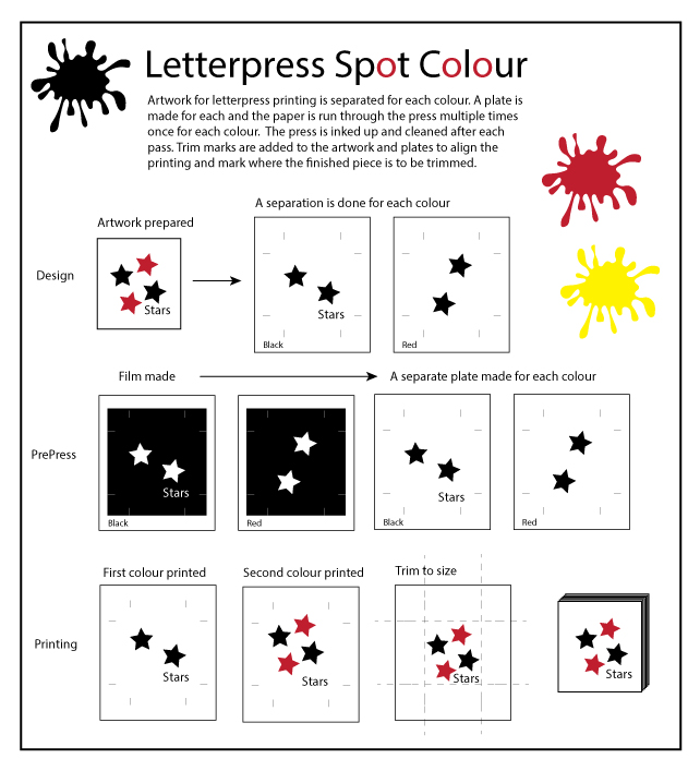
How spot colour is done on letterpress
Colour printing can be letterpress printed like offset printing using the 4 colour process. This involves printing cyan, magenta, yellow and black to simulate a wide range of colours. Using letterpress techniques to do this is extremely rare, very expensive, time consuming and, limits the paper choices and techniques available for printing letterpress. Colours used in letterpress printing are created without screens or dots, such as those found in the PANTONE MATCHING SYSTEM®. From a palette of 18 basic colors, each of the spot colours is mixed according to its own unique ink mixing formula.
A separate piece of artwork is created for each colour to be letterpress printed. That artwork is transferred to film and from that a plate is made for each. The plates are mounted to the single colour press and printed in precise alignment on the paper.
The illustration below shows the process graphically.